There Is No Act Three To The American Horizontal Oil Boom

0

If you are looking for a reason to get bullish on future oil prices look no further. The chart below is one of the most bullish charts in the energy patch today.

crude oil growth

This chart tells us two critical things.

First, it tells us that the horizontal oil boom is due almost entirely to only two plays, the Bakken and the Eagle Ford. Second, it tells us that production growth in these two plays is flattening significantly.

And the news gets worse (or better if you are long oil), because according to the most informed horizontal driller in the United States, there is no “next” big horizontal play waiting in the wings to follow the Bakken and Eagle Ford.

EOG Resources has perhaps the best visibility on where horizontal oil and WTI prices are going. EOG is the largest horizontal oil producer in the United States (and therefore the world) by a considerable margin.

top oil producers

EOG produces twice as much oil from horizontal wells than its nearest competitor. This is the foremost voice on American horizontal oil production.

EOG’s CEO and Chairman Bill Thomas recently spoke at the Sanford C Bernstein Strategic Decisions Conference and made very clear that his company is very bullish on oil prices.

Thomas was specifically asked at the conference if he was concerned about the lower prices that the futures market was predicting for oil. His response was that he believes that the futures market is mistaken and that the steeply steeped backwardation is inaccurate.

wti future price


Source of graph data: CME Group


The front month prices of West Texas Intermediate oil futures is now, and has been in a very steep state of backwardation. Backwardation is where the prices of contracts with later delivery dates are trading well below the near term contract price.

Where today WTI is selling for over $100, looking forward to 2017 and beyond the market seems to think that the price of oil will be closer to $80.

I can’t ever be sure why the market does what it does. Most people think it’s because while geopolitical events are supporting the near term price of crude, the surging supply of American oil production will cause it to drop in the longer term.

What EOG and Thomas believe is that despite the incredible rate of growth in US oil production, pure crude oil horizontal plays are actually very rare and becoming harder (not easier) to find.

Thomas notes that EOG has scoured the country looking for a third major horizontal oil play to follow the Bakken and Eagle Ford but the search has come up empty.

There are other, smaller high quality oil plays but there is nothing in the pipeline that is close in size to the main two. Together the Bakken and Eagle Ford account for 75% of horizontal oil production in the United States.

There’s no Third Act here, and production growth in the Bakken and Eagle Ford is already slowing.

The Bakken and Eagle Ford are so special not just because they’re big; they’re also simple. They’re like flat layer cakes that go for tens of miles, and there are no surprises; you know where the oil is and how to turn the well to go horizontal in every well.

Now look at the Monterey formation in California. It’s potentially big, but it sure isn’t simple.

In 2010 the EIA (Energy Information Agency) announced that the Monterey contained almost 14 billion barrels of “technically recoverable” oil. At that figure the Monterey made up 60% of the recoverable shale oil in the United States.

This spring, the EIA recently reduced its estimate of recoverable oil in the Monterey by a whopping 96%…..down to only 600 million barrels. The reason? It’s not a layer cake, it has been tectonically rolled over a few times and oil is in tough to get at small chunks.

Now, IMHO, there are two Brutal Facts that could kill EOG’s Beautiful Theory (and for all energy investors, it’s Beautifully Bullish Theory).

One is the Permian Basin in west Texas. It’s big and simple; the right makeup for horizontal production capability.

But Thomas contends the Permian is not a pure crude oil play. The Permian is a “combo” play–meaning that it has lots of natural gas, and natural gas liquids, but not nearly the quantity of oil that the Bakken and Eagle Ford have.

EOG’s Thomas addressed the Permian specifically at the Bernstein conference by noting “that while the Permian has a big boe (barrel of oil equivalent) count, the play is heavy on the “e’s” and not so much on the “o’s”…….”.

Gotta say, I’m not convinced on his Permian argument. But I think his overall point is valid. The core of the Eagle Ford and Bakken are being drilled now and everyone is extrapolating to a huge extent.

The second Brutal Fact is something that EOG is doing itself, and very well—increasing recoveries. Producers are learning how to get more and more oil out of wells, and they’re putting down more wells every square mile than ever before. That doesn’t kill the theory, but it could sure delay it by a few years.

The company continues to innovate in both the Bakken and Eagle Ford and increasing both the quantity of oil that can be recovered and the profitability of each produced barrel.

Since entering the Eagle Ford in 2010 EOG has increased its internal estimates of oil reserves in the play from 900 million barrels to a staggering 3.2 billion barrels.

reservie potential

That increase has been created through trial and error. EOG has worked to figure out the optimal number of wells to drill on the land and where to place them.

The company has also increased productivity of each well by perfecting drilling and completion techniques that have allowed for the amount of oil recovered per well to be increased.

And EOG isn’t done making both the Eagle Ford and Bakken bigger. The next step is going to come through enhanced oil recovery which is common to the oil industry but not to horizontal production. Through the application of water or natural gas flooding it is likely that recovery factors in these plays will again rise significantly.

For investors, the takeaway is that yes the horizontal boom is real and will continue, but the rate of production growth is going to slow and there isn’t another Bakken or Eagle Ford in the on-deck circle.

That should be long term bullish for oil prices and may eventually show the current futures curve to be significantly too low.

by +Keith Schaefer

Energy is Leading the Market in 2014…

0

…Let me tell you what that means

By Donald Dony

Sector rotation is the normal evolution of different industry groups to a recovering and expanding economy.  It is also affected by investors trying to anticipation this expansion.

Chart 1 illustrates the usual rise and fall of different key industry groups.

sector rotation 
In a bear market (declining stock market and economic contraction), most sectors pullback, however, defensive industry groups such as consumer staples, pharmaceuticals and utilities typically display greater relative performance.

As the low in the equity markets arrives, investors quickly move into the early responders.  Sectors such as the financials, consumer discretionaries and transportation are usually the first to profit from a bottoming market and the anticipation of a soon-to-be recovering economy.

With the stock market and the economy beginning to rebound, investors are focusing on industry groups that can quickly turn profitable after the economic contraction.

After the financials, consumer discretionaries and transportation sectors, the technology, services and construction groups are typically the next industries that become profitable with a rebounding economy.

The late contraction and early expansion phase is usually about six to eight months.

With the economy and the stock market on solid footing, sector rotation enters the middle expansion stage.  This phase is often the longest and can last 2-3 years.  Industry groups that display stronger growth during this segment are capital goods, basic industry and materials (building supplies, lumber and base metals).

However, as the economy and stock market enters the late expansion or last phase, there is another change to investor’s attitudes.  During the bull market, investors typically focused on either business groups that would profit from the current phase of the economy or try to anticipate sectors that would benefit from the next stage of the market.

However, during this phase, capital flows begin to divide between sectors that profit from a very mature (late expansion) economy and a potential peak (defensive). This is where we are now.

The current bull market and business cycle began in 2009. Throughout the next five years, sector strength has been in financials, consumer discretionaries, industrials, technology and healthcare.  The weakest performing sectors have been energy, consumer staples and utilities (Chart 2).
chart 2
However, in early 2014, a dramatic shift occurred.  Energy, utilities, consumer staples and materials had become the best performing sectors and the normally strong industry groups such as consumer discretionaries (cyclicals), healthcare, technology, financials and industrials were the lowest performers (Chart 3).

The late and final expansion of the economy and bull market has begun.

This last phase is normally measured in months and not in years.

Energy should continue to show greater relative performance over other groups, however, as this last phase progresses defensive sectors (consumer staples and utilities) are anticipated to gradually outperform.

chart3

+Keith Schaefer

Here’s What Happens When You Only Read the Headline

0

I’m a retail investor and I make retail trading mistakes.  I get nervous too early…even on stocks in which I have high conviction.  Sometimes I skim press releases I should really read in-depth.  Multi-tasking during research is not a good idea.

It happens to all of us at different points in our investing lives.

When we don’t do enough left brain analytical work, our right brain emotions can take over, and we become swayed by headlines and CNBC, and make irrational decisions.

Energy investors are especially susceptible to this now, in springtime, the shoulder season in the energy sector, when commodity prices soften and greed turns to fear.

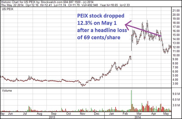
A good example of this is the April 30 headline by a company I cover called Pacific Ethanol—PEIX-NASD.

The stock tanked on May 1, despite the company announcing record cash flow, record debt reduction and the re-start of an idled ethanol plant.

All that information was even in the upper highlight section at the top of the news release.

The problem was the headline – a loss of $0.69 per share. It brought in a wave of selling, sending the stock down over 12%.  All the newswires ran with the $0.69 loss.

How could record cash flow and debt repayment turn into a $0.69/share loss?  It was a non-cash item, a $35.8 million “fair value adjustment” to some outstanding warrants.

It’s hard to believe, but the fact that the stock tripled from $5-$15.59 during the quarter caused the problem.   There were several million warrants outstanding with a strike price of $7.75, and accountants say that warrants are a liability to a company when the share price moves above the strike price of the warrants – which is the fixed price warrant holders can pay to buy shares.

With most of the five million outstanding warrants having a strike price below $8/share, accountants saw Pacific Ethanol as having a massive liability, potentially selling millions of shares to warrant holders for roughly half of market value.  I am not making this up.

Of course, shame on management for not putting in an adjusted EPS headline.  But the moral is headlines move stocks, even though headlines often give the wrong impression.  And all the real data was in a highlight section, in bullets, right at the top of the page.

It would have taken 5-10 seconds for investors to understand the real story.

PEIX Nathan chart EPS loss May 22 14

The stock has slowly recovered.  Pacific Ethanol is trading at 2X annualized EBITDA and effectively has no net debt, but what are the prospects?

Ethanol companies turn corn into gasoline.  Right now PEIX is buying corn at under $5/bushel, then spending $1.30/bushel moving it to their ethanol plants on the West Coast, for a delivered cost of $6.30/bushel.

_______________________________________________________________

Join Keith Schaefer at the Canadian Investor Conference!

June 1 – 2, 2014 at Vancouver Convention Centre West

Visit us at booth #235 or attend the Diversified Watchlist Panel on Monday,
June 2nd from 1pm-2pm


A bushel of corn makes 2.8 gallons of ethanol, so basic production costs (called the simple crush spread ) are $2.25 per gallon ($6.30/bu / 2.8 g/bu)

Wholesale, or rack gasoline sells at $3.00/gallon, while ethanol in California typically trades close to gasoline prices.  California is short ethanol and must pay higher prices to bring it in from the Midwest.

Ethanol typically trades at a $.60 per gallon discount to gasoline in the Midwest.  Add $.35 per gallon costs to move it to California, and west coast ethanol trades $.25 below gasoline, or $2.75 in the current environment.

Simple math of $2.20 production costs and $2.75 sales prices = $.50 per gallon margins on 182 million net gallons a year to PEIX—or $141 million annualized.

That’s not bad for a $280 million market cap company.  And they are now effectively net debt free—delevering the story gives the stock more upside.

The story gets better: there are shortages of ethanol nationwide due to exports, which have caused California prices to trade ABOVE gasoline prices.

PEIX also sells distillers grains, a byproduct of production, at a premium in the animal feed market.  Drought-stricken California is what we call a “feed-short” market.

The futures market for ethanol is suggesting very strong margins in the Midwest through the end of 2014 (ranging from $.37 to $.68 per gallon, depending on the month and averaging $.51 per gallon through year end)

And the latest agricultural data (http://usda.mannlib.cornell.edu/usda/current/CropProg/CropProg-05-19-2014.pdf) is showing corn plantings improved to 73% this week (just below the 5 year average of 76%), and the two big corn states, Iowa and Illinois, are both 84% planted.

That should be Game, Set and Match for lower corn prices in 2014. Assuming corn stays at $5 or lower (the USDA forecasts corn prices will trade between $3.85 and $4.55 per bu over the next year) and gasoline stays at current levels, PEIX can make 50 cent/gallon plus margins as far as the eye can see.

But on April 30, all that quality data—good left brain information—didn’t mean anything.  A retail driven stock succumbed to a bad headline and investors who didn’t take 30 seconds to learn the real story.

It happens to the best of us, doesn’t it?

Disclosure–Keith Schaefer owns Pacific Ethanol.

P.S. One reason ethanol stocks have done so well is high gasoline prices.  That’s a function of high oil prices, and that’s why oil stocks have been the best place to be so far in 2014.  There is one stock head and shoulders above the rest—new discoveries, fast growth and incredibly profitable wells make it my #1 Oil Stock for 2014.  Click here to find out what it is.

by +Keith Schaefer

Where The Big Money Is…Has Changed

0

Canadian energy stocks are playing serious catch up to their American cousins this year. And I think that should continue through 2014—Canada is the Best to Invest in energy for the first time in 2-3 years. Last year, everybody’s money was going into US stocks—in almost all industries. Energy was no exception. There wasn’t a lot of love for the Canadian juniors.

I made all my money in 2013 in the US—in the first half on refinery stocks, and the second half on ethanol stocks.

But 2014 is different.  The stocks of junior Canadian producers started pricing in higher gas prices and profitability late last year, and in February exploded up as natgas actually did move up.
tsx capped energy

There’s five factors driving this ramp in Canadian energy stocks as far as I can see—with the most important ones first:

  1. Lower Canadian dollar—it has touched 88 cents once this year and is hanging around 90 cents. A lower loonie = lower costs and higher cash flows for Canadian producers. This has really helped the light oil producers.
  2. High natural gas prices thanks to the very cold winter. This has changed the psychology of the North American gas market, but even more so in Canada. Ontario’s storage is almost rock bottom empty. Alberta’s is a little better, but there is a lot of work to do. And now, no utility wants to get caught without full storage in case next winter is like this one. Executives will get fired if they don’t have enough gas come December.

Canadian natgas stocks didn’t really respond until mid-February when the Prairies had a few weeks of -20 to -40 degree weather. Gas prices started to spike to $8/mcf—and stayed there for a few days. Stocks started to move.

The stocks leading the charge up were the old favourites of 3-5 years ago; stocks that used to be $15-$20 but had fallen down to $6 or $8. Painted Pony, Crew Energy, and NuVista would fit that bill. This group of stocks all took off mid-February.

crew energy


3) The belief that more heavy oil refinery capacity in the US—especially BP’s refinery in Whiting Indiana—will reduce the discount for heavy oil to light oil. Canada has a lot of heavy oil.

4) Rail has done an amazing job getting Canadian oil to market—all over the US and Canada. Southern Pacific (STP-TSX) is now sending rail cars all the way down to the US Gulf Coast from the oilsands. This relates to Point #3 above—the Market no longer sees big blowout discounts for Canadian oil.

5) US valuations are high—Canada is seen as a discount. Though it was interesting to read recently in the weekly BMO energy report that the discount has narrowed–junior and intermediate valuations between US and Canadian listed stocks are closer now after this big run. To me, the most important ratio is Enterprise Value to EBITDA–that’s what I pay the most attention to.  And that shows Canadian juniors as the cheapest stocks on the board.

industry

But it still feels like the US is more expensive…likely because of the great formations with multiple payzones that the US has in places like the Permian. Even the big independents like EOG and Pioneer doubled last year, and the successful juniors like Bonanza Creek (BCEI-NYSE), Matador (MTDR-NYSE), Laredo (LPI-NYSE), Goodrich (GDP-NYSE) and others tripled or quadrupled.

But most of those stock charts have stalled or declined since last October. And sentiment on the Street is the Canadian energy sector is seeing a lot more international money flow than last year.

One Canadian analyst, Geoff Ready of Dundee Securities in Calgary, suggests American investors are “just warming up to the better royalty regime (in Canada). Most Canadian assets reside on crown lands where all three Western Canadian provinces have royalty incentives for horizontal wells.

“Usually these include early life royalties of only 2.5%-6% versus the freehold royalties more common in US plays that are generally in the 20-25% range. If costs and productivity are similar among two plays, this variance in royalties can make a big difference in overall well economics.”

One example of that is the new discovery by Crescent Point (CPG-TSX) along the Saskatchewan-North Dakota border.   CPG has successfully produced from the Torquay formation now, which lies just under the Bakken.  This formation is called the Three Forks in the USA, and has been drilled extensively.  But there are two very different royalty regimes on the play on either side of the border, as Ready says.

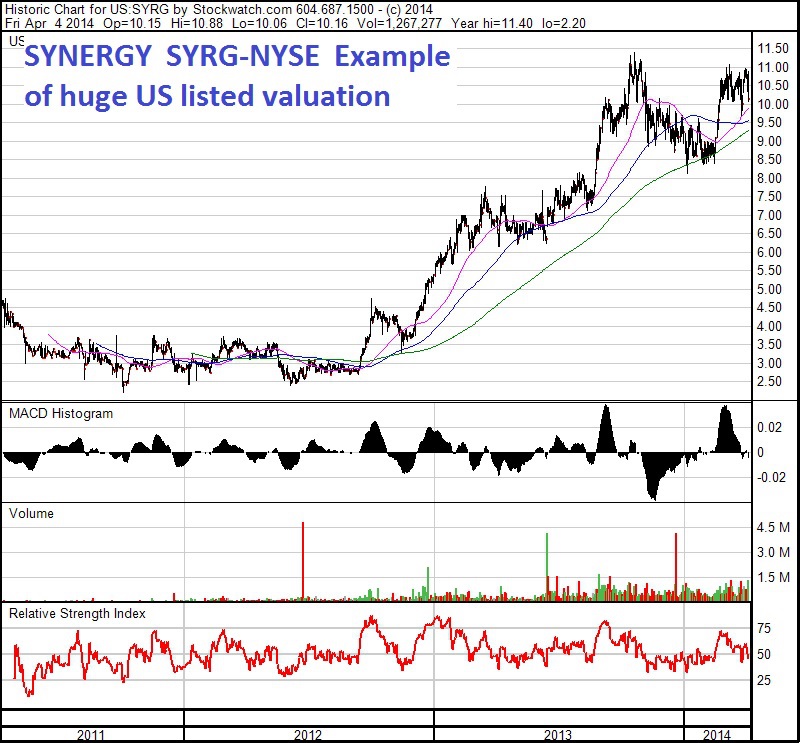
One other factor I’ve noticed is that the US market is willing to give stocks a HUGE multiple EARLY if they like the play, and then the company has to spend a lot of time backfilling the value into the stock.   The US energy juniors have bigger runs sooner–often MUCH bigger runs because they have fewer shares out, but higher debt leverage.  They can get up to 11-12x cash flow–BUT, then spend 2-4 years backfilling the value into the stock, in a flat stock chart.

Now, I often like expensive stocks—they tend to stay expensive, and cheap stocks tend to stay cheap. Honestly, my biggest winners have been like this.

But I couldn’t bring myself to buy Synergy (SYRG-NYSE) at $3 two years ago despite one of my best contacts beating me over the head with the stock. It was always over $175,000 a flowing barrel, and often over $200K. The stock hit wll over $10 recently, and it’s still very expensive.

synergy


Finally, it could be argued US stocks deserve higher valuation as their infrastructure so much better and they don’t have spring break up, so consistency of pricing and product is better

But also, because Yankee investment culture allows their producers to get very leveraged at 4-5x debt to cash flow, it could be argued they don’t have quite the same capital discipline.  BusinessWeek just ran a great story on how producers were raising hundreds of millions of dollars, after explaining to investors they have not made money for years and would only return $1 for every $4 they would be about to spend. And as a result, when commodity prices crash, their survival is in doubt more than Canadian stocks.

For the first time in two years, my Big Winners are in Canada.

by +Keith Schaefer

When Two Investing Theories Collide – Quicksilver (KWK-NYSE)

0

WHAT DOES AN INVESTOR DO?

This stock is not an OGIB portfolio stock.   But I did enough research on it I didn’t want to think those hours had gone to waste….

I want to tell you a story about two investors I know really well.  One is a chartist, and loves technical analysis.  He buys breakouts, and has done well in the market over the last year doing that.

My other friend spends a lot of time researching fundamentals, trying to find unappreciated stories with unappreciated catalysts, finding stories like Rock Energy at $2.15, and Donnycreek at 37 cents.  One friend lives on my right shoulder.  The other one lives on my left.

Sometimes my two friends agree on stocks, but not always.

Sometimes they even violently disagree, like they do on Quicksilver (KWK-NYSE) right now.

The stock is close to breaking out technically—it had a great up-day today. I confess I do really like the chart.  But it’s not a breakout until $3.80 with volume.

 quicksliver chart

But fundamentally, the company is a bit of a disaster.  I haven’t done exhaustive research on the stock, but it clearly levered up prior to the gas price collapse.  I checked research going over a year and one theme was clear “Reduced estimates on lower production and higher cost guidance”.

Thomson Reuters is showing just over $1.5 billion debt. KWK has been successfully selling assets to get that down—a joint venture in the Permian in Texas, a 25% sale of their Barnett assets in Texas…those two totaled $500 million.

As a result, production continues to decline year after year, quarter after quarter.  They have now hedged 75% of their 2014 production at $5.08/mcfe—million cubic feet equivalent.  (Canadians report in barrels of oil equivalent – boe).  There is also a turnaround on cash flow—they said they broke even in Q4 2013 on cash flow.

But IMHO it isn’t that strong a turnaround just yet.  No, the REAL reason to own Quicksilver is its Horn River Basin (HRB) dry gas play in northern B.C., in conjunction with its LNG (Liquid Natural Gas) asset in Campbell River B.C.—which is only about 100 miles north of Vancouver up the coast, but on Vancouver Island. You can read about it here—www.discoverylng.com

They have said they are going to find and secure a well-heeled strategic partner for this LNG initiative, and the stock may be reflecting that.

Several analysts who follow the stock say this issue makes the stock a binary trade.  (I HATE binary trades.)

I’ve been up to Campbell River many times.  It calls itself the Salmon Capital of the World—well, the Queen Charlotte Islands are, but Campbell River says they are.  Fishing isn’t near what it used to be there.  But the riptides run 11-15 knots at high tide!  You see whirlpools with vertical edges a foot high. There used to be a mine and a mill there too.  It’s a quiet place now.

Quicksilver’s Campbell River site is an old industrial facility, and Quicksilver has plans to start at about 0.75 bcf/d, or 5 million tons per annum (5Mtpa) after all approvals & initial construction is in place—which has yet to happen.  They have the pipeline capacity to get the gas from the HRB (on the Yukon border) down all the way to the US border.  They just have to get it up to Campbell River.

Without it this LNG idea being executed….well…the company is almost all natural gas and has a debt to cash flow ratio of about 8.5:1.  Eight point five to one.    ALL the analysts have price targets LOWER than where the stock is today.   KWK has 172 million shares out.

So as you can appreciate, there are a lot of shorts all over this one—

Quicksilver’s HRB wells are very prolific—up to 20 mmcf/d for IP rates.  The wells likely cost a bit more than the Montney but are getting twice the dry gas rates—and if gas can stay in the $4.50-$5/mcf range this year, the economics on these wells could be fantastic.

horn river
The Market is expecting an LNG or HRB joint venture in the next 1-2 months.  This has been in the analyst reports for a full year; everybody knows it’s coming.

But the stock is suggesting somebody thinks they know something right now.  My one friend says the chart looks good—at $3.80 with volume it looks great.  But my second friend says without a pretty rich LNG deal, the company’s future doesn’t.

by +Keith Schaefer

Six Bullish Oil and Gas Charts

0

By Donald Dony, Editor www.technicalspeculator.com

Energy sector swings to performance

As the bull market starts its 6th year and the 3rd longest advance since 1920, we see several signals that are common to the later phase of a mature market.

The first is the relative performance shift out typical bull market sectors and into commodities and energy.

During the first and middle phase of a bull market, The financial, consumer discretionaries, technology and transportation sectors display the greatest relative performance.  As the bull market continues to age, the performance slowly shifts to basic industry and capital goods.  However, in the last stage, the energy and precious metals (materials sector) begins to shine (Chart 1).

chart1

Over the past 60 days, that  movement has become apparent.  In Chart 2, the S&P/TSX energy and Materials sectors have the greatest performance.

Safe haven sectors have also started to flex their muscle.  Within the top four performing industry groups over the past 60 days, money has been flowing into the utilities and consumer staples sectors along with energy and materials (Chart 2).

Bottom line: The recent rise in performance of the energy and materials sectors highlights the likely arrival of the late bull market.  This also suggests that the top of the long advancing market is near.

chart2

WTIC: Higher levels

Light crude oil prices are respoding to an improving (though sluggish) world economy and recent high demand from the eastern U.S. for heating oil plus the Crimean/Russian crisis.

WTIC has held to a well defined upward sloping channel for over a year.  With gradually improving momentum, oil is expected to retest the upper channel line in late Q3 or early Q4 and ultimatly reach $115-$117 (Chart 3).

chart3

Natural Gas:  Higher highs and lows

The 1st season for Natgas is coming to an end.  Early to mid-summer should be the 2nd seasonal movement.

This commodity is, however, not displaying the usual in-between season price weakness.  Natural gas is remaining in a positive trend with higher highs and higher lows.

After establishing a bottom in the first half of 2012, the resource has steadily risen in price.

The outlook for natural gas is for a continuation of the main upward sloping channel.  Support is at $4.00.  The top channel line suggests ultimately a $6.50-$7.00 target is possible.  Nevertheless, the near-term target is more modest at $5.50 (Chart 4).

chart4

Conclusion:

The S&P/TSX Energy sector continues to strengthen into mid-year.  As a late bull market industry group, the recent high level of performance and the movement of capital out of traditional expanding economic sector implies that the bull is very mature.  Nevertheless, the “sweet spot” for energy has arrived and will likely continue for several months.

Light crude oil higher points to $105 and, we believe, ultimately to $115-$117.

The price of natural gas is also improving as the summer weather approaches.  Our models suggest that $5.50 will be tested again.

After scanning both US and Canadian energy equities for strong technical charts, here are six favourites:

chart5 chart6 chart7 chart8 chart9 chart10

I talk to Donald a couple times a week and appreciate his insight.  At $105/year, I think his letter is the 2nd best bargain for a newsletter I know of ;-).  To subscribe, click here – https://www.technicalspeculator.com/login.php?var=sb535962718fec3

Getting Ready for a Natural Gas Rebound

0

The Set-Up:  In February 2014 I wrote a story on how the US arm of brokerage Raymond James saw a lot of negatives for Canadian natural gas.  Longer term that could be true but in this article OGIB guest writer Shaun Polczer—who was formerly an energy writer at the Calgary Herald and Petroleum Economist magazine—takes a look at Canadian natgas for a more bullish reason.

Getting ready for a natural gas rebound

It’s true that Canadian natural gas exports to the US have been falling for more than 10 years.

From a peak of more than 10 billion cubic feet per day in 2001, exports to the US were a little more than 8 bcf/d in 2012, according to the Energy Information Administration (EIA), a drop of 20 per cent in less than a decade.

And it’s also true that long-term exports are likely to free fall as prolific US shale fields like the Marcellus and Utica supplant traditional Canadian markets in the high-consuming northeast.

But this shouldn’t be misconstrued as the end of Canadian gas. There are plenty of reasons to suggest that producers north of the 49th parallel could be in good stead for the next 24-36 months after the coldest North American winter in a dozen years.

Lower 48 storage levels are the lowest in a decade, at less than 1 trillion cubic feet heading into summer. Producers on both sides of the border will have to inject 3 trillion cubic feet by next fall to rebuild a comfortable cushion — something that’s never been done.

Canadian storage levels are also essentially depleted, meaning that AECO gas from Alberta could actually trade above Henry Hub for the first time in memory. Bentek Energy’s Jack Weixel sees strong markets for Canadian producers in Dawn, Michigan, and Chicago as storage is refilled.

That’s prompted Duncan Robertson with Calgary-based SBM Consultants to conclude that the gas market actually turned in April of last year. SBM doesn’t call prices, but rather, broader trends. And after five years in the gutter, the signal for gas has finally turned green.

“We’re bullish,” he said in an interview. “Storage is essentially empty. We think now is the time to be investing in gas.”

California Dreaming

But refilling storage should only be a temporary boost, lasting until the buildout of pipelines from Pennsylvania and Ohio. The real reason to be optimistic for the longer term is in the Pacific Northwest and drought ravaged California.

Traditionally, the majority of Canadian gas has flowed west to east from Alberta on the NOVA pipeline, an inter-provincial network that once accounted for a staggering 20 per cent of all the gas produced on the continent.

Because of the mountains, the north-south route leading into Washington state and Northern California was always considered a less desirable route than NOVA for capturing premium pricing — for the simple reason that it’s geographically isolated from major markets.

But what was once a competitive disadvantage has now turned into a major opportunity.

Gas demand in the Pacific-Northwest is poised to jump before the end of the decade, a combination of electrical power growth and rising consumer and industrial use, but mainly due to LNG exports. On March 24, the US Department of Energy approved an application from Calgary-based Verasen to export 1.5 bcf/d from its proposed Jordan Cove LNG plant in Oregon. Originally designed to import gas from offshore, it has been reconfigured to export to Asia.

A second application is pending for another terminal up the coast, also in Oregon. Given that the northwest has no indigenous gas supply, it will either come from Canada or via Kinder Morgan’s Ruby pipeline from Wyoming. Although Canadian gas competes head on with Ruby, Warren Waite, Bentek’s senior energy analyst, notes that 60% of the gas presently comes from Canada.

Longer term, energy consultants ICF International predicts an additional 2,500 MW of gas-turbine capacity will be needed by 2025 to support wind generation in the Northwest, and that nearly six per cent of the region’s total natural gas demand will be for that purpose, especially in peak winter periods.

That should provide a boost for northern British Columbia Montney producers until Canadian LNG exports come onstream after 2016. This is one of the reasons Canadian Natural Resources dropped $3.1 billion for Devon Canada’s conventional gas assets, the majority of which are concentrated in the northern BC.

But the real story is further south, where California is in the midst of one of its worst droughts with water levels at hydroelectric stations falling to half of normal levels. After the closure of the San Onofre nuclear plant near San Diego — called Dolly Parton by the locals — the state has been relying on hydro to make up the gap.

The problem is, hydro capacity is half what it was last year and a third of what it was in 2011. If there’s an El Niño this summer, experts are already warning of brown outs and extreme power shortages similar to 2004.

Little wonder, power producers are switching to gas because it’s more reliable. According to Picton Mahoney Asset Management, utilities in California could see an uptick of 700-800 million cubic feet per day from fuel switching alone, notwithstanding summer cooling demand in the event of a hot summer.

In the northern part of the state, that gas comes from Alberta, via TransCanada’s Foothills pipeline feeding off the big NOVA pipeline and flowing through Redwood Pass.

Bentek’s Waite said drought conditions generally worsen further to the south, and the real question is how much Canadian gas will be diverted east to refill storage. It’s possible that exports to California could actually dip, setting up a supply crunch in the event of a hot, dry summer. “There’s definitely a need for it (Canadian gas). There’s a 50/50 chance of El Niño — that could change things but it’s a tough call at this point.”

At some point, more pipeline capacity from the Montney and other Canadian producing regions are needed to satisfy LNG demand in addition to any incremental additions from fuel switching, according to Housley Carr with RBN Energy consultants. That will largely be determined by price, keeping in mind that higher prices will stem demand growth.

What it means

The bottom line is that Canadian gas is going to be in demand this summer, regardless of whether it flows east or west.

According to GMP Securities, a handful of Canadian producers stand to benefit immediately, even as BC gets ready for large scale LNG exports. Keep in mind that producers on this side of the border need to demonstrate 25 years of reserves before the National Energy Board will grant export licenses. That’s in addition to any incremental demand from the US.

In a recent research report, GMP likes Painted Pony (PPY-TSX) and another handful of producers that hadn’t previously benefited from BC royalty changes announced in March — including Artek (RTK-TSX), ARC Resources, Crew Energy (CR-TSX) and Crocotta (CTA-TSX). Northern Montney producers in the Umbach area, such as Storm (SRX-TSX), Carmel Bay (private), Paramount (POU-TSX) and Chinook (CKE-TSX) will all benefit.

Toss in the usual cast and crew from the WCSB in Alberta and Saskatchewan — the Encanas,(ECA-NYSE/TSX) Talismans (TLM-NYSE/TSX) and PennWests (PWE-NYSE; PWT-TSX) of the world, in addition to the aforementioned CNRL, and we have the makings of a natural gas party.

It’s also likely to lead to a new round of consolidation and mergers among smaller juniors who have had a hard time raising capital. The small fish will be looking to gain scale, while the big fish will keep getting bigger.

With so many companies to choose from, it’s a licence to drill, baby, drill.

+Keith Schaefer

Some Not-So-Hot Facts About Global Warming Research–Global Cooling Part III

0

Consider this:

-In 2013, the UK had the coldest spring since 1963.

-In March 2013, Northern Japan received record snowfall–up to 16 ft thick just south of Aomori.

-In October 2013, the worst frost in more than 80 years hit Chile and damaged 50 million boxes of fruit for export—damages were over $1 billion.

-And my personal favourite—an expedition vessel full of Climate Change scientists became trapped in Antarctic sea ice 10 feet thick on Christmas Day 2013.

These true-life stories are examples of global cooling—from all over the globe.

In Parts I and II of this series, I outlined the long term cycle of temperature changes on Earth, and how sunspots have had an eerily accurate correlation to earth’s temperatures for centuries.  Data strongly suggests that solar cycles have a definite impact on the world’s climate.

And right now, the best data on sunspots also suggest the world is about to enter a time of global cooling.  This doesn’t deny that mankind is influencing the world’s climate; sunspots’ very regular 11 year cycles can temporarily overwhelm a larger context of man-made (the scientific term is anthropogenic) influences.

But even that becomes somewhat suspect.  Evidence either uncovered or chronicled by a Boston-based research firm, Unit Economics, suggests that government and their scientists, together and independently, have been manipulating data (and caught red handed!).

The February 28, 2014 research paper by Unit Economics on global cooling goes into pages of detail on how some of the most important—and allegedly impartial—raw climate data has been regularly altered by private and public sector members of the scientific community.

And that’s really too bad, because people working on questions around global temperature have very few datasets to choose from.

One is the temperature anomaly dataset developed by NOAA (the US National Oceanic and Atmospheric Administration).   The other is from the Met Office Hadley Centre in collaboration with the Climatic Research Unit of the University of East Anglia in England, which is known as the HadCRUT3 dataset.

NOAA started developing its temperature database in the early 1990s. It was revised once in 1997, and then three times between mid-2011 and the end of 2012.

NOAA says the revisions dealt with new observations methods, corrected coding errors, and removed unnatural influences from things like changes in how instruments were stationed.

In short: lots of revisions, little specific explanation. Not surprisingly, people started accusing NOAA of data tampering (google NOAA data tampering)…and when Unit Economics compared the 2008 NOAA dataset with the most recent version, the changes looked like this:

NDAA

Overall, the man-made adjustments created an additional 2.48°F temperature change over the past 100 years – more than the 1.85°F of total warming the NOAA says has taken place since 1913!

Sadly for the general reliability of science, the HadCRUT3 dataset is no better.

CLIMATEGATE

This HadCRUT3 dataset is the basis of the Intergovernmental Panel on Climate Change (IPCC).  The IPCC ‘s job is to create a “clear scientific view on the current state of knowledge on climate change and its potential environmental and socio-economic impacts”.  That’s a mouthful.

The IPCC data did show increasing temperatures. Then, in October 2009, someone broke into a British office of the CRU, downloaded 160 MB of data and emails, and posted them online. The stolen CRU emails show prominent scientists discussing ‘adjusting’ data to reduce Medieval Warming Period and hiding very recent cooling trends, and making sure they all agree and aren’t stepping on each others’ toes. Many of these discussions ended with instructions to delete all records of the conversation.

Eventually a U.S. Senate inquiry was set up under chairmanship of Edward Wegman, professor of mathematics and statistics, and their report ruled that Penn State Professor and IPCC lead author Michael Mann’s work was ‘statistically invalid’.

But even all this couldn’t ‘adjust’ away the reality completely: the tampered HadCRUT3 data still shows global temperatures trending lower over the last 15 years.

CRU Global temperature

And there are some basic facts question the thesis that manmade CO2 is causing global warming.  As I said in Part I,  temperatures actually fell during the peak expansion of manmade greenhouse gas levels from 1940-1970.

Second, if CO2 emissions cause global warming the layer of the atmosphere 5 to 10 km above the earth where CO2 interacts with sunlight should be warming more quickly than the earth’s surface. In fact, temperatures at these levels have been unchanged since accurate balloon measurements became available 50 years ago.

Third, CO2 levels have cycled significantly over the known history, which stretches back 400,000 years. Our planet has survived CO2 levels roughly half of current concentrations and nearly twenty times higher! That certainly makes the commonly quoted claim that a CO2 concentration above 350 ppm leads inexorably to warmer temperatures seem pretty weak.

Fourth, atmospheric levels of CO2 increased from just under 300 ppm in 1900 to 397 ppm today, yet temperatures fell through much of that period and have increased by only 0.7°F overall – and that’s based on heavily manipulated datasets.

And there are some groups, such as the Carbon Modeling Consortium at Columbia University, that suggest human activities in United States may actually reduce atmospheric CO2 levels.  In an October 15 1998 issue of the Columbia University News, author Taro Takahashi, a senior research scientist wrote:

“We know that we who reside in the United States emit about 6.2 billion tons of carbon dioxide into the atmosphere each year. As an air mass travels from west to east, it should receive carbon dioxide and the East Coast concentration of CO2 should be higher than on the West Coast. But observervations tell us otherwise.

“The mean atmospheric CO2 concentration on the East Coast has been observed to be lower than that over the Pacific coast. This means that more CO2 is taken up by land ecosystems over the United States than is released by industrial activities.”

Other tidbits:

-Sea levels are DOWN by .2 cm (0.08 inches) since 2006.
-The polar bear population is up all across the Arctic—as much as 66% in the last 50 years and 13% in the last 5 years.
-water vapor in the air has been declining—more vapor, higher temperatures.  Less vapor, lower temperatures.

Again, the current global cooling could be taking place within a larger context of man-made climate change.  But even that becomes doubtful when the most basic, raw, original datasets are shown to be corrupted.  And there is enough seriousscientific peer review to question the IPCC climate reports—thanks go to Canadian Ross McKitrick from the University of Guelph and German scientist (and former Global Warming advocate) Professor Fritz Vahrenholt, who wrote Die Kalte Sonne (the Cold Sun) in January 2012.

There’s a great quote in Unit Economic’s report that puts this all into context:

“If one accepts the notion that the sun, which provides over 95% of the heat energy to the surface of the earth, has the potential to impact temperatures, it would be logical to incorporate observations and predictions of solar activity in climate models and forecasts – something most meteorologists and virtually all global warming enthusiasts fail to take into account when modeling earth’s climate. We believe this is because solar cycles explain climate cycles on earth too well, leaving too little room for CO2 to influence their models.” Weiss and Naleski, Unit Economics’ 2014 Report on Global Cooling.

The Real Inconvenient Truth is that there is enough flawed data to question just how serious Global Warming is, or if it’s real at all in the short to medium term. Is the hysteria warranted?  Keep your mind open, despite the intense politically correct forces out there who make that a crime on this issue.

Privacy Overview

This website uses cookies so that we can provide you with the best user experience possible. Cookie information is stored in your browser and performs functions such as recognising you when you return to our website and helping our team to understand which sections of the website you find most interesting and useful.